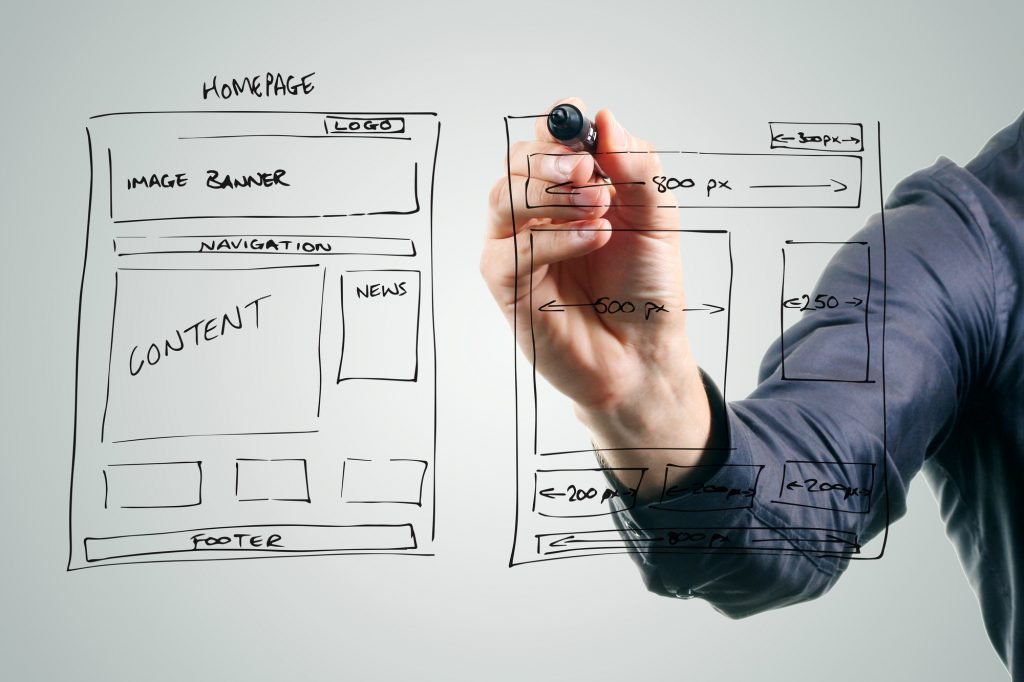
You’ve been told that all you need to succeed in blogging is content.
And if you have the best content then you will have the most successful blog, RIGHT?
Wrong!
The important step before visitors can even SEE your content is… FORMATTING.
Visitors look at formatting first, words second.
Once you’re mastering great content and WordPress formatting, you will become an engagement magnet!
Here is the inside information that will keep visitors on your site and make more money.
WordPress Formatting: 101-401
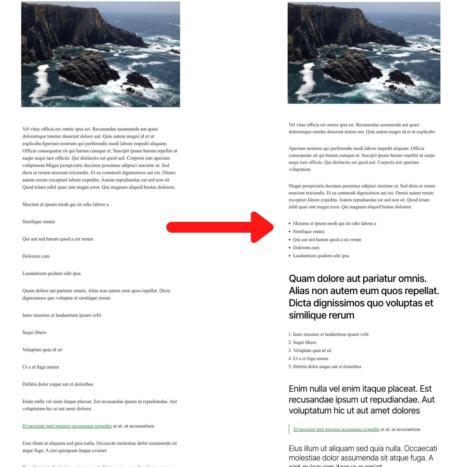
Keep Your Paragraphs Short
A paragraph is the content of the article and is made up of normal text. (Not Headlines.)
No one likes to read a long paragraph, because it’s boring! And you need more and more concentration for each line.
But if you break up the same paragraph, people will have an easier time reading every line.
The loooong paragraph doesn’t give your eyes a break. So visitors will start skipping lines.
Also,
Most people now search from phones or tablets and the shorter paragraphs make it much easier to see and follow.
Use 1-2 lines for easy reading. 3 lines MAX. But make those sentences shorter.
Use Bullet And Numbered Lists

Giving quick information makes the blog post engaging.
After images and infographics, people search for bullet points and headings to find what they are looking for.
Visitors are on your website to find what’s useful to them, not you.
Instead of going through the complete blog post, visitors scan through heading and bullet lists looking for the information they want.
When writing bullet and numbered lists:
- Keep the length of sentence short
- It’s better to use easy to read phrases
- Include only the valuable stuff because it’s the deciding factor for staying or going
- Use bold and italics to highlight the important words
Use BOLD and ITALICS to Emphasize Important Words

Bold important words and phrases to make articles more skimmable. You want the bold words to draw the eye, so your reader doesn’t have to read every single word.
Use Italics in your Headlines and for emphasis on words and phrases.
You can bold or italicize phrases or the short sentences.
But the point is to make it easier to read. If you use bold and italics too much, your page will turn into a soupy mess.
The Best Way To Use Headlines
Heading Tag
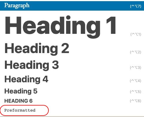
The Heading tag is the most important tag for blog format.
It has a number of benefits, regardless of the size of the text.
Some of the benefits are:
- SEO
- Readability
- Breakaway point
- Easier navigation
The letter “H” plus the number of the heading is what gives you the tag:
Heading 1 = H1
Heading 2 = H2
How To Use A Heading Tag The Right Way
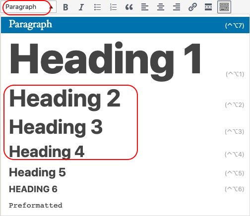
The title of your blog should always be Heading 1 or H1.
Only use it for your main title. A single post shouldn’t contain more than one H1 tag, ever.
Use the smaller numbered Headings to organize your post and make it easier to read.
There are H2, H3, H4, etc.
Search engines use headings the same way your visitors do. They scan for information.
They glean content and context from your heading.
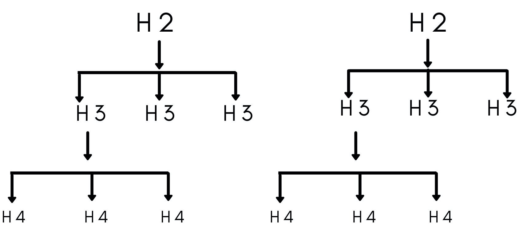
Always Follow The Heading Hierarchy
Keeping your post organized keeps your post readable.
Use this chart to get an idea for how headlines flow.
Subheading Contents Should Be Less Than 300 Words
Put no more than 300 words under a heading.
If you have more than 300 words, break up the content into two different headings.
Use the heading tags to allow visitors to find their topic of interest.
Use Internal Links To Your Other Content
Interlinking your pages gives the visitor a way to explore your site. Topic by topic.
But going wild with your links only makes you look salesy and tacky.
- Respect your readers time on your page by giving them helpful information
- You should only link the relevant pages.
- Hyperlinks should only be around 4 words long.
- The words should preview what the link is about.
Image Alignment Best Practices
Images are the first thing to draw the eye in any blog article.
An image can be a chart, graphs, infographics, or photos, or infographics.
They all have their place and keep the visitor informed at a glance.
If you are using a photo as an image, then center alignment is the best option to showcase the image.

If an image needs explanation, the best practice is to align the image to the left or right then add text next to the image.
When you upload an image, be sure to fill out all the boxes: alt tag, title, etc.
It will enhance the searchability of the image and the article.
Block Quotes Don’t Work
Block quotes don’t help you.
Block quotes are a short chunk of the article set aside in a block, away from the rest of the content. There is no reason to present content in this fashion.
If the content is relevant, why break up the flow of your page to show off? Find a better way to format it.
If the content isn’t relevant, then you are not respecting your visitors time. And you shouldn’t use block quotes.
There is an old school marketing idea that using block quotes makes your page stand out and get better rankings.
It was considered an acceptable trade off to annoy the readers because it helped you trend better.
But that is not how Google ranks pages anymore.
So now it’s just annoying.
Make Sure to Go Back A Look At It From The Front End
Okay. Now, you think you have successfully formatted the article.
You got the paragraph length nailed down, you have your lists, your heading game is on point.
You used grammar and editing tools to tear it all down and rebuild it better.
Make sure to do one final thing!
Go and see how it really looks on your webpage BEFORE you hit Publish.
When you check your front page you may find it looking weird, with the words and lines in the wrong place.
These are common rendering errors that you can easily fix.
Here’s how to fix the most common rendering problems on WordPress.
When Text In WordPress Is Not Rendering Correctly
When Your Text Goes Off-Screen
The WordPress theme is the major culprit for rendering problems.
Include the following code into the header section of the header.php file to the active theme.
<meta name="viewport" content="width=device-width, initial-scale=1.0" >
The above code will render the text correctly on the screen according to the width of the screen.
Text Rendering Outside Of A Text Box
Sometimes, you might find the problem of text rendering outside of a text box.
In that case, you need to utilize the “overflow” property in the “CSS” code.
There are many reasons this might happen, too many to list here.
The above link will take you to w3schools.com, which is a database of code and examples of how to use that code, written in simple English and not coding jargon.
When Your Non-Letter Characters Don’t Display Correctly
Seeing weird characters on your blog?
The difference in character set is the reason for the appearance of weird characters.
When the database is using the “Latin” character set but the website is using “utf8” character set, weird characters appear.
To fix the problem, use the following line of code in the “wp-config.php” file by putting “//” in front of the following code.
define(‘DB_CHARSET’, ‘utf8’);
define(‘DB_COLLATE’, ”);
Note: wp-config.php is the core file of WordPress. So, before taking any action, be sure you have a backup of wp-config.php.
If it doesn’t solve the problem, install the plugin “search and replace plugin” and manually replace the weird characters.
Final thoughts
No matter how much time you have invested in researching a topic, if you haven’t invested time in formatting the article, your effort will go down the drain.
Engaging the visitors on your website is mandatory for SEO and conversions.
So what are you waiting for?
With these formatting techniques, you can increase the on-page time, reduce bounce rate, and become an engagement juggernaut!

